
Do you have columns of data? Do you have rows of labels? Do you like heat?
You can make a heat map for quick visual analysis of tables! Using R, a free, open source interactive statistics package available on Windows, Linux, and Mac OS, you can load your .csv data, define some colors, et voila! You find out where teh hotz is.
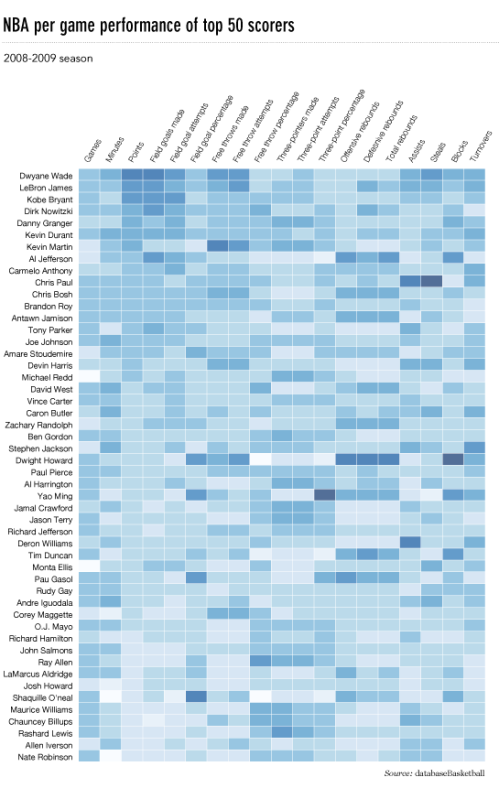
What is a heat map, in this implementation? The source article describes it as “a table that has colors in place of numbers. Colors correspond to the level of the measurement. Each column can be a different metric like above, or it can be all the same like this one. It’s useful for finding highs and lows and sometimes, patterns.”
Intelligence analysts and RCMP officers may see a use for this in SLEIPNIR.
via How to Make a Heatmap – a Quick and Easy Solution | FlowingData.
