Tag Archives: mapping

R and ggPlot

Plotting the Afghan war, via Open Source Tools Turn WikiLeaks Into Illustrated Afghan Meltdown Updated | Danger Room | Wired.com:

It’s one thing to read about individual Taliban attacks in WikiLeaks’ trove of war logs. It’s something quite different to see the bombings and the shootings mount, and watch the insurgency metastasize.

Even more Afghan visualizations thanks to WikiLeaks are available  at Visualizing Data.

Leave a comment

Filed under Analysis Ideas, mapping, visualization

All about the Benjamins: The Growth of Walmart

This visualization only looks like the spreading of a horrible plague. It is instead of the growth of Walmart and Sam’s Clubs throughout the United States. Starting in the relatively quiet 1960’s, Walmart added one or two locations a year. The flow accelerates until in 2010 there are 4393 stores studded across an apocalyptic consumerist landscape.

Watch the Growth of Walmart and Sams Club Across America | FlowingData.

Leave a comment

Filed under mapping, visualization

Density Mapping in Google Maps

Google API add-on lets you make heat maps inside a Google Map portal!

HeatMapAPI can be used over the Internet or as a .NET DLL that runs in a local environment and allows you to integrate heat map images into Google Maps or other GIS systems.  In this post we’re going to use HeatMapAPI to visualize the density of recent Starbucks store closures.  In a recent statement, Starbucks announced the closure of 600+ stores in the United States due to economic conditions.

In other news, we’d like to thank Starbucks for providing their easily-parsed list of closures. Most visualizations I’ve seen are using this dataset.

via Density Mapping in Google Maps with HeatMapAPI « GeoChalkboard.

Leave a comment

Filed under Analysis Ideas, mapping, Web tool

German Immigrants in the USA

A map of the USA showing where bars outnumber grocery stores.

Bars outnumber grocery stores

FloatingSheep, a fun geography blog, looks at the beer belly of America. One maps shows total number of bars, but the interesting map is the one above. Red dots represent locations where there are more bars than grocery stores, based on results from the Google Maps API. The Midwest takes their drinking seriously.

FloatingSheep.org.

via Where Bars Trump Grocery Stores | FlowingData.

Leave a comment

Filed under mapping

Introducing News Dots – By Chris Wilson – Slate Magazine

From Slate: News Dots. This little Flash-driven app renders the day’s events as a social network.

Like Kevin Bacon’s co-stars, topics in the news are all connected by degrees of separation. To examine how every story fits together, News Dots visualizes the most recent topics in the news as a giant social network. Subjects—represented by the circles below—are connected to one another if they appear together in at least two stories, and the size of the dot is proportional to the total number of times the subject is mentioned.

Introducing News Dots – By Chris Wilson – Slate Magazine.

Leave a comment

Filed under mapping, visualization, Web tool

ClearMaps: Actionscript Data Visualization

From Sunlight Labs:

Despite the recent explosion of web based cartography tools, making effective maps for data visualization remains a challenge. While tools like Google Maps are great for helping navigate the world they are often poorly suited for thematic mapping, as many features like roads and cities only get in the way of telling compelling stories with data. In fact, even the distance between places can be a distraction – who cares how far away Alaska is when the goal is to make a simple comparison between US states?

Here’s the github project so you can play around:
http://github.com/sunlightlabs/clearmaps/

via Sunlight Labs: Blog – ClearMaps: A Mapping Framework for Data Visualization.

Leave a comment

Filed under mapping, visualization, Web tool

OpenStreetMap and Haiti Relief

Here is a visualization of the efforts of an impromptu crowd community to produce accurate maps of Haiti following the earthquake. Each dot shows a volunteer contribution–and the blue dots show camps of displaced people. An astonishing amount of information, but then, many hands make light work.

via OpenStreetMap Edits Towards Haiti Relief | FlowingData.

Leave a comment

Filed under mapping, Online event, visualization

Make a Treemap with R!

Tree  Maps are much more tree-like than Tree Diagrams. Here is another great “R” project from FlowingData blog.

Treemap uses proportional boxes to show size

Back in 1990, Ben Shneiderman, of the University of Maryland, wanted to visualize what was going on in his always-full hard drive. He wanted to know what was taking up so much space. Given the hierarchical structure of directories and files, he first tried a tree diagram. It got too big too fast to be useful though. Too many nodes. Too many branches.

The treemap was his solution. It’s an area-based visualization where the size of each rectangle represents a metric since made popular by Martin Wattenberg’s Map of the Market and Marcos Weskamp’s newsmap.

See SmartMoney’s live-updating Treemap of the stock market. (Health care and energy are big movers right now.)

via An Easy Way to Make a Treemap | FlowingData.

Leave a comment

Filed under Analysis Ideas, How-To

One way to profile Facebook users

We’ve been wondering how to do analysis on Facebook users, given those pesky privacy settings that can lock out all the cheerful bots and scrapers of market researchers. If you can’t see a profile, you can’t… well… profile. Can you?

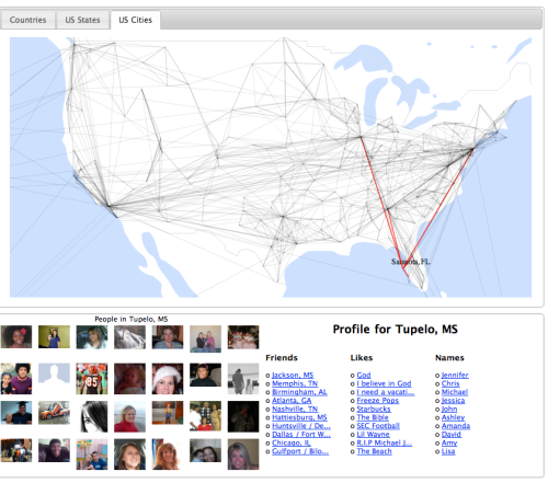
Freeze Pops group on facebookEnter FanPageAnalytics.com, which cleverly uses Facebook fan pages, and builds datasets based on who “Became a fan of…” various things. For example, who likes Freeze Pops? And what would an ambitious, cut-throat Freeze Pop executive give for a detailed profile of desert-dwelling fans?

From the About page: Fan Page Analytics uses over 100 million public profiles to offer detailed information on popular brands, bands, politicians and celebrities.

As a result you get gorgeous visualizations like this:

The data is already being used to make new borders for post-2012 North America, after the Mayan calendar has expired and the US government collapses:

The image above shows connections between locations which share friends. “For example, a lot of people in LA have friends in San Francisco, so there’s a line between them.” Given this beginning:

Looking at the network of US cities, it’s been remarkable to see how groups of them form clusters, with strong connections locally but few contacts outside the cluster. For example Columbus, OH and Charleston WV are nearby as the crow flies, but share few connections, with Columbus clearly part of the North, and Charleston tied to the South.

PeteSearch Blog: How to split up the US.

Leave a comment

Filed under Analysis Ideas, visualization, Web tool

NNDB: Tracking the entire world

If this doesn’t bring to mind Analyst’s Notebook and Palantir, what would? There have been many web-based link diagrammers released (tracking facebook friends, twitter topics, etc), but this one seems to be usable for generating actual results.

The NNDB Mapper is a visual tool for exploring the connections between people in NNDB, linking them together through family relations, corporate boards, movies and TV, political alliances, and shadowy conspiracy groups. Maps can be saved and shared for others to explore.

You start with a search, say, Lynx Gaede, 1/2 of the Nazi teenie-bopper twin band Prussian Blue. Here is her profile page on NNDB: http://www.nndb.com/people/053/000113711/

Then, click the NNDB Mapper in the top right corner.  http://mapper.nndb.com/start/?id=113711

You get a simple entity link map. Hover the mouse over April Gaede, the stage mom, and in the resulting dropdown, click “Expand 3 Nodes.” Then do the same with National Alliance, and you will see luminaries like Kevin Strom, founder of the National Vanguard.

In this way you can being uncovering connections between people. The database appears to be crowd-sourced, so it gets more useful and complete the more people use it. Neat.

The maps can get complicated. Here’s the New York Times link map.

via NNDB: Tracking the entire world.

While we’re on it, who are Prussian Blue? Here’s the documentary: http://www.archive.org/details/MichielSmit.comPrussionBlueMichielSmit.com

Leave a comment

Filed under Analysis Ideas, Web tool